EDUCATION FOR
THE PEOPLE
CAMPAIGN
Now more than ever we need a message that
stands out from the crowd.
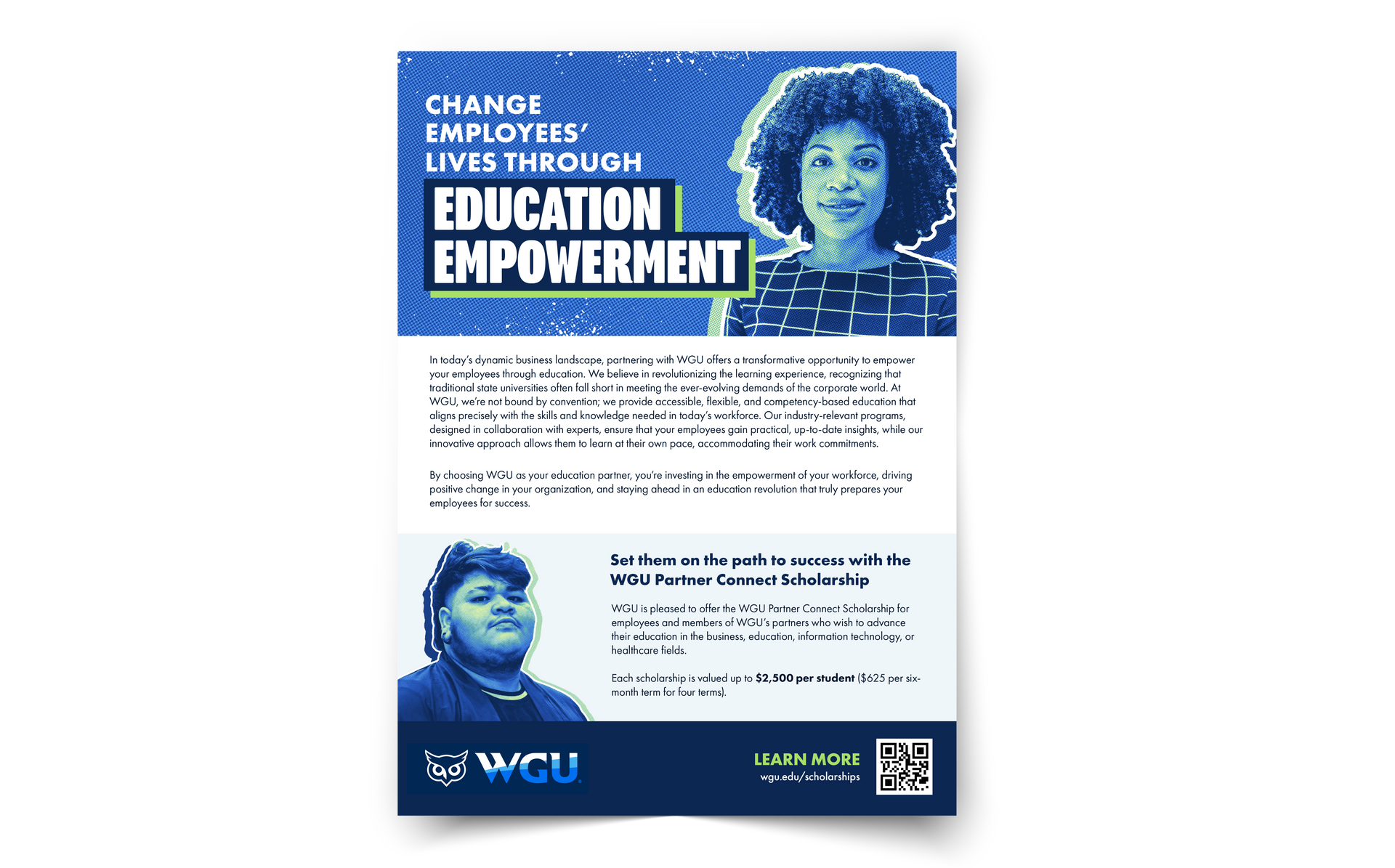
creative POV: EDUCATION FOR THE PEOPLE
It’s saying the quiet part out loud
People have been feeling like college is becoming inaccessible for years now, and the traction in that sentiment is only growing. WGU, since it's inception, has been all about providing education without barriers, and we always have, and always will, stand with the students.
It's a new way of thinking about wgu
Putting the student first in everything we do is nothing new to WGU, but how we say it in this campaign is. We are not just talking about changing education, we have lived it for almost 30 years now. We have always been bold in our approach to education, and now we can show it too.
It stands out in a crowded market
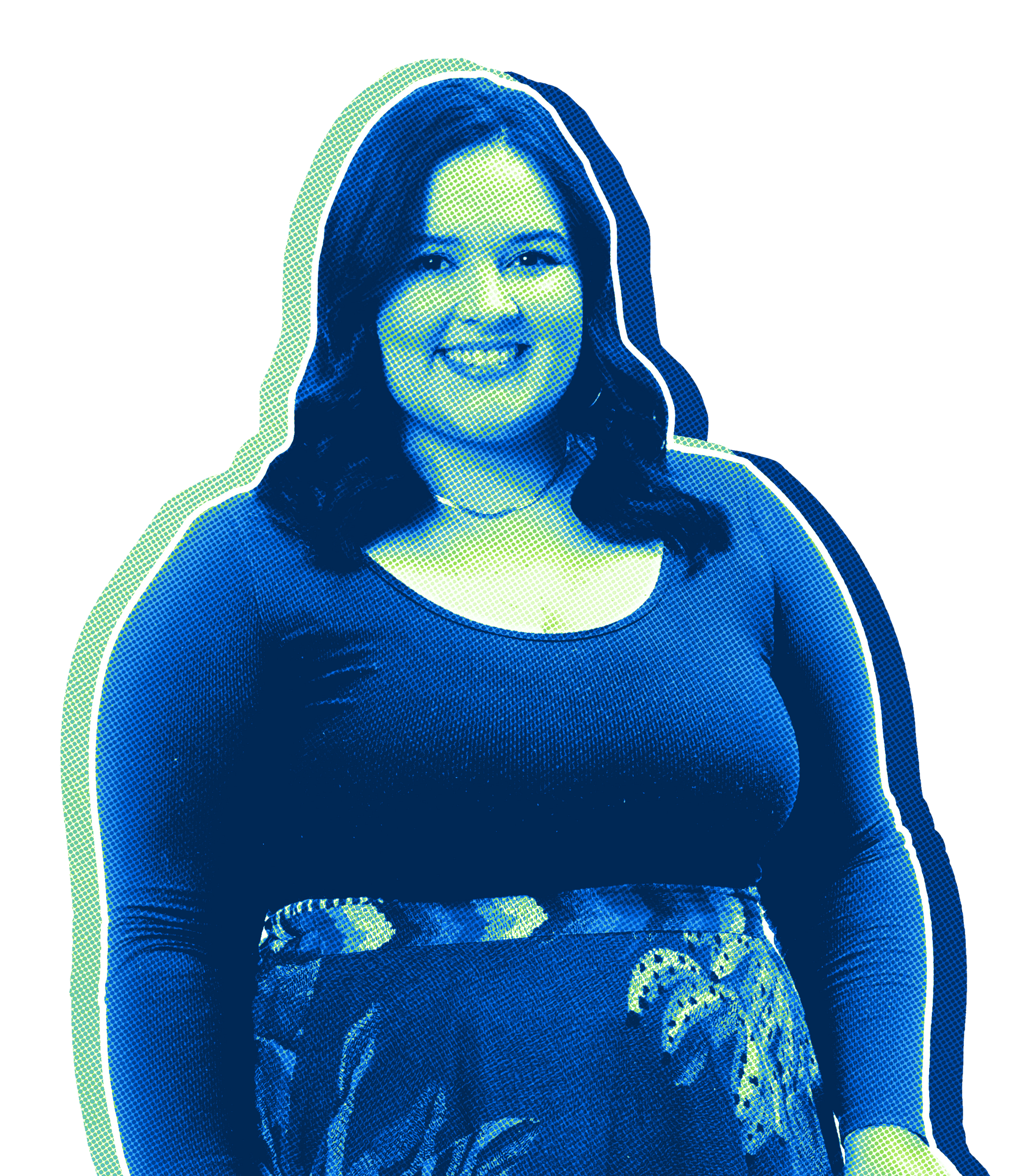
Let's face it—there are a lot of schools out there making new ads every day. We wanted to cut through the crowd with a completely unique and ownable style that screams WGU. This new half-tone style with our brand colors stops viewers, and the messaging really brings our point home.
It positions WGU as a leader, not a follower
While much of higher education reacts to trends, WGU has consistently set its own course. We didn’t wait for the system to change—we built a better one. This POV positions WGU as a confident leader, showing that our model isn’t experimental or aspirational; it’s proven, intentional, and designed to move education forward.
creative components
TYPOGRAPHY:
PROGRAM NAR OT BLACK
Font applied to the main message.
FUTURA PT BOOK
Font applied to body copy.
design elements:


color palette:
Hex: 003057
CMYK (100, 84, 39, 33)
RGB (0, 48, 87)
Hex: 46B1EF
CMYK (62, 15, 0, 0)
RGB (70, 177, 239)
Hex: 97E152
CMYK (43, 0, 87, 0)
RGB (151, 225, 82)
Hex: FFFFFF
CMYK (0, 0, 0, 0)
RGB (255, 255, 255)