LOGOS
WGU’s logos are a graphic representation of WGU and all that the university stands for. It portrays the institution to the outside world and serves as the university’s visual signature. A strong, recognizable, university-wide visual identity is a key element in building and maintaining WGU’s reputation in the global community. See how our logo represents WGU’s mission.
ContentS:
Download Updated Logos
Quick guide: Which logo to use
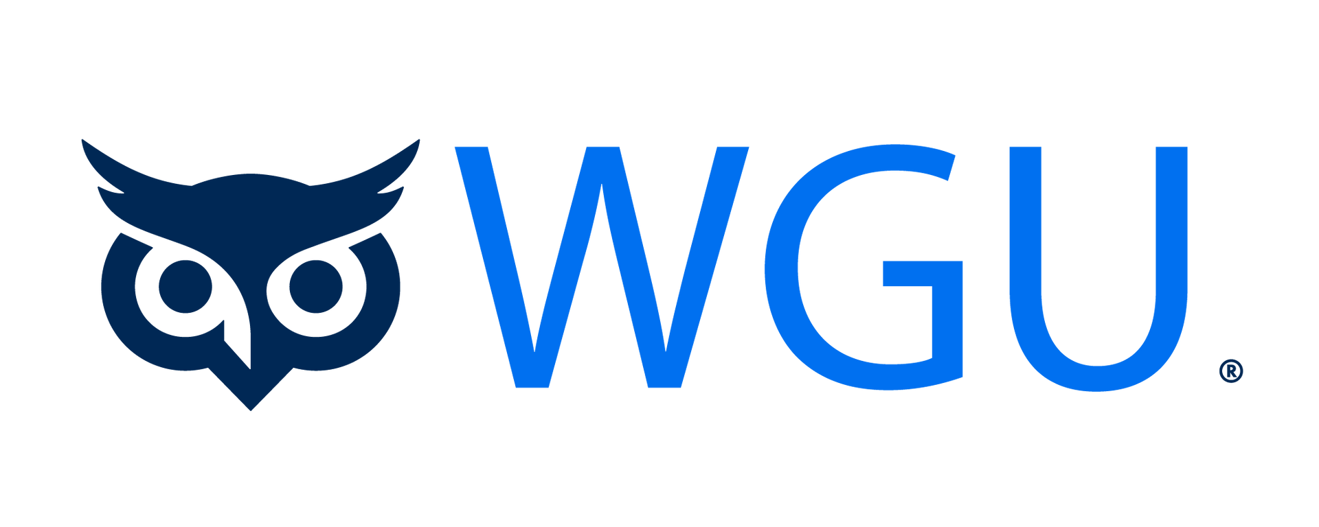
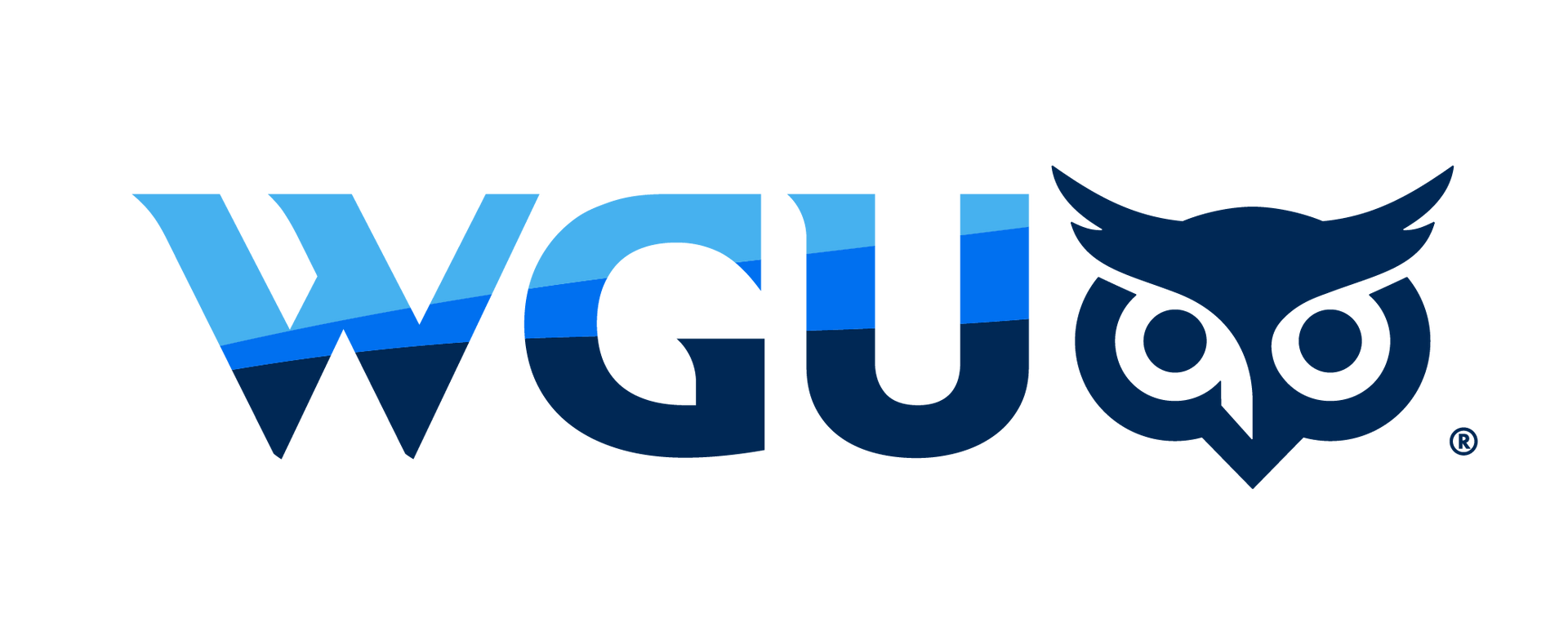
University Logo
If the asset only pertains to the university, use the university logo with the owl.
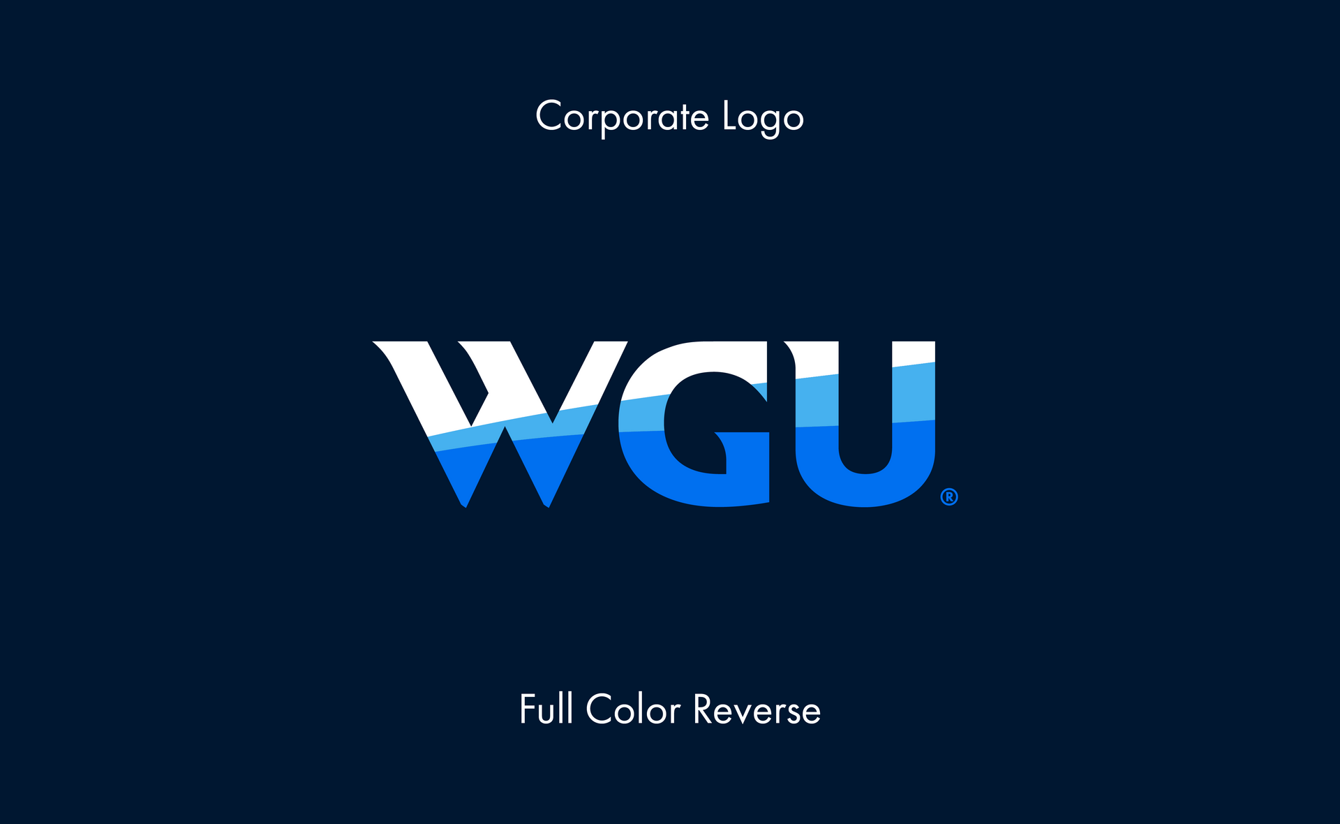
Corporate Logo
If the asset primarily addresses external stakeholders or WGU-wide internal business needs, use the WGU corporate logo.
School Logo
The university logo is the default, but the school logo may be used when the goal is to emphasize a specific school or program.
Owl Icon
Use it alone only if it is presented only to students, alumni, or employees.
Academic Seal
The seal is restricted to official documents and select commencement assets. Swag must be cleared with brand governance on a case-by-case basis—no exceptions.
WGU Academy and WGU Labs Logos
These logos should be used for WGU Academy and WGU Labs business as usual.
Craft and Juvo Ventures
These entities’ original logos are typically used, but the “A WGU Company” label can be used at the organization’s discretion to emphasize the relationship with WGU.
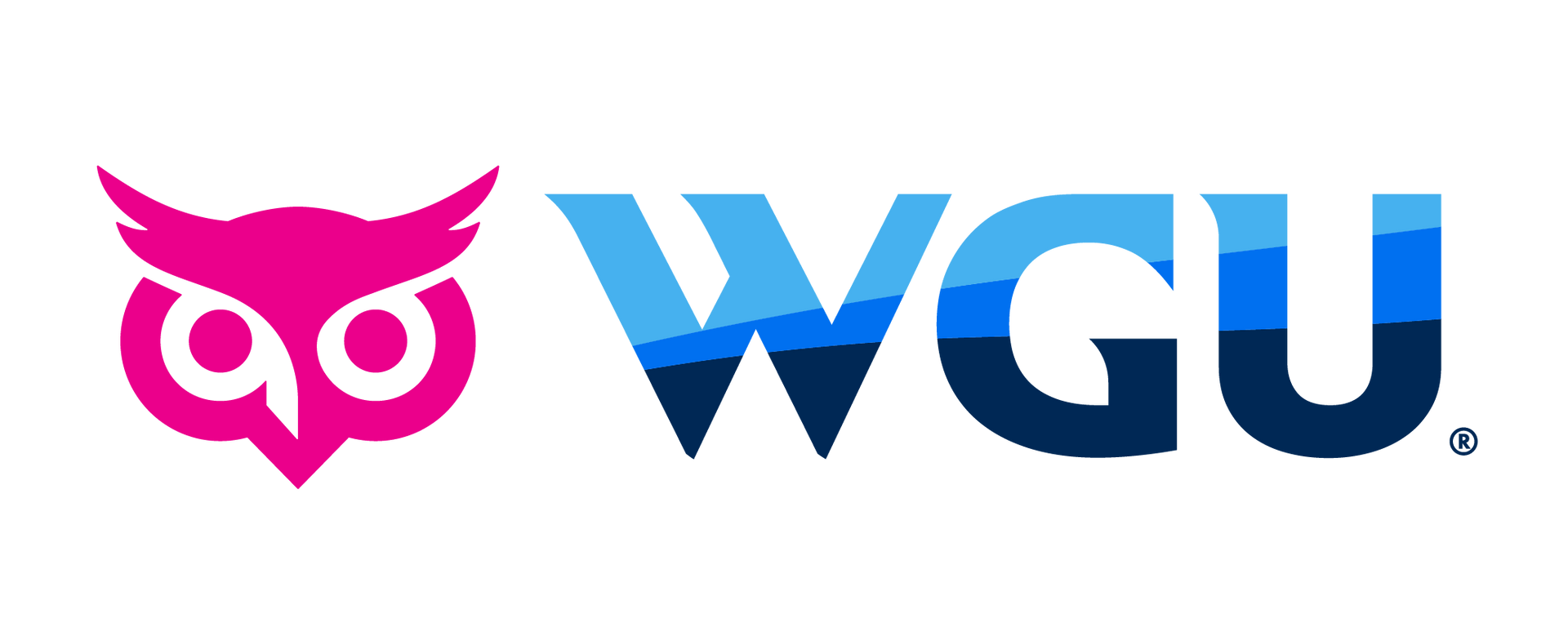
University logo
Our primary logo is the keystone of our visual identity. Consistency in its use will establish trust in its appearance and the institution behind it. Select the primary logo that best fits your needs. Use proper clearance and minimum spacing. The university logo is the preferred choice for most instances and should be the only logo used in upper-funnel marketing assets. If you have questions on logo usage, please contact the Creative Team.
Slide title
Write your caption hereButton
Slide title
Write your caption hereButton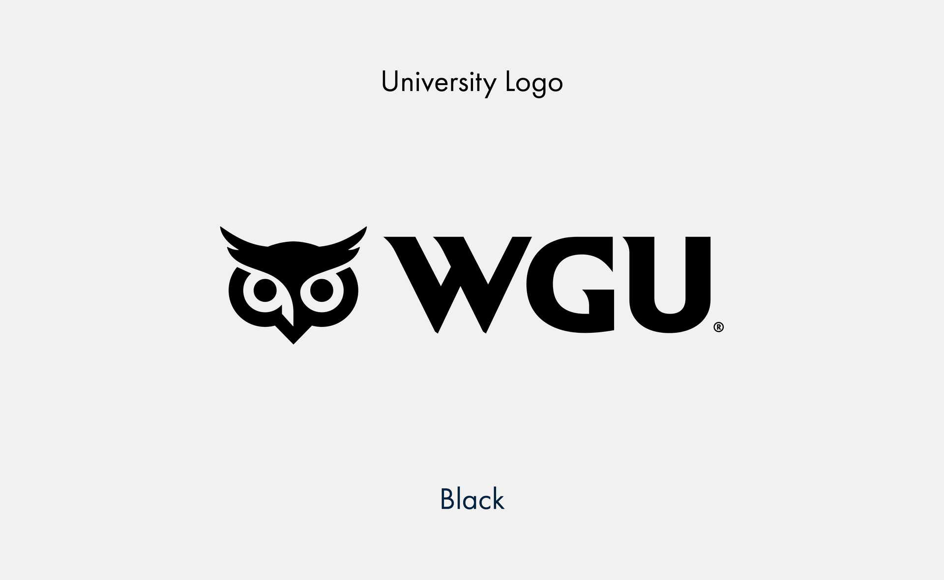
Slide title
Write your caption hereButton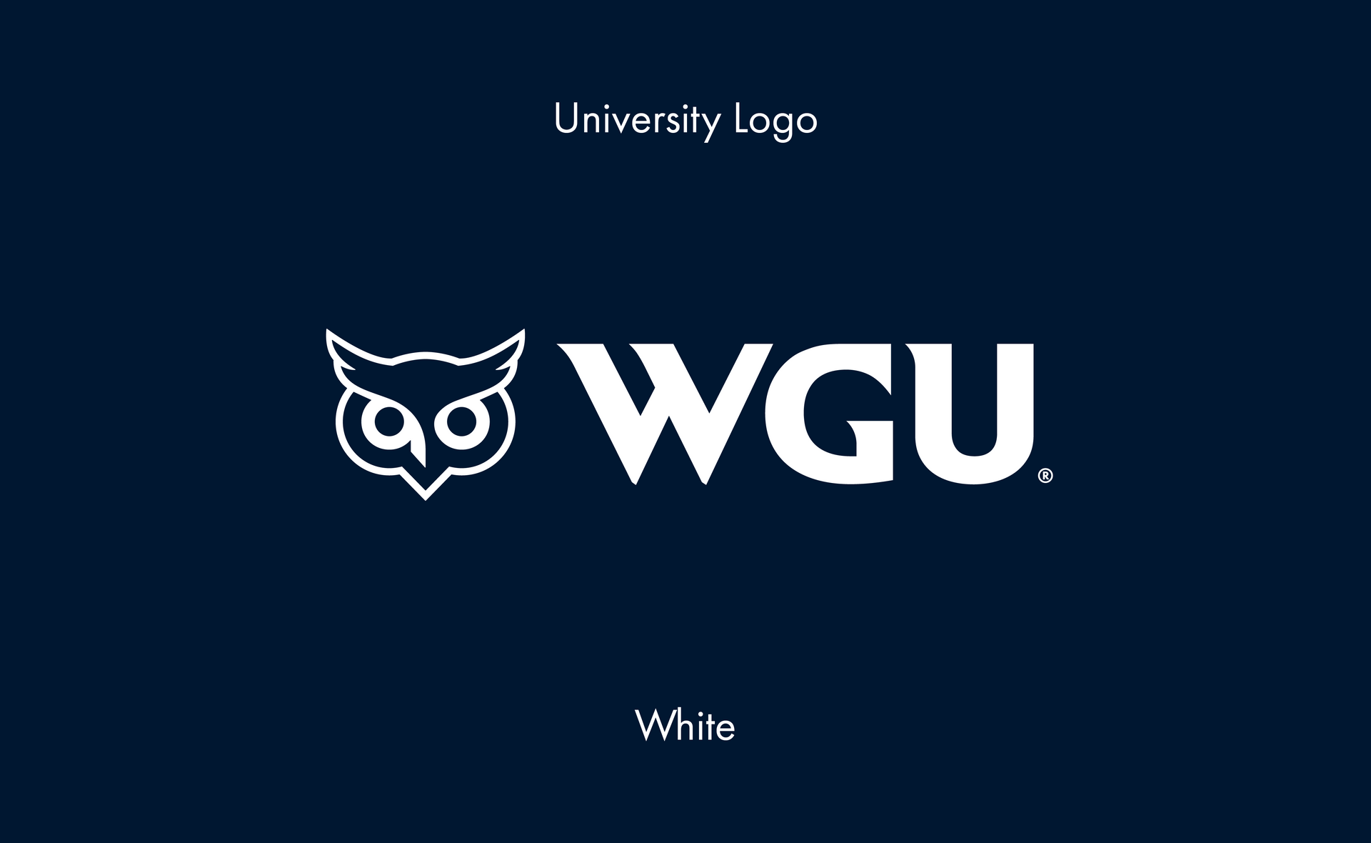
Slide title
Write your caption hereButton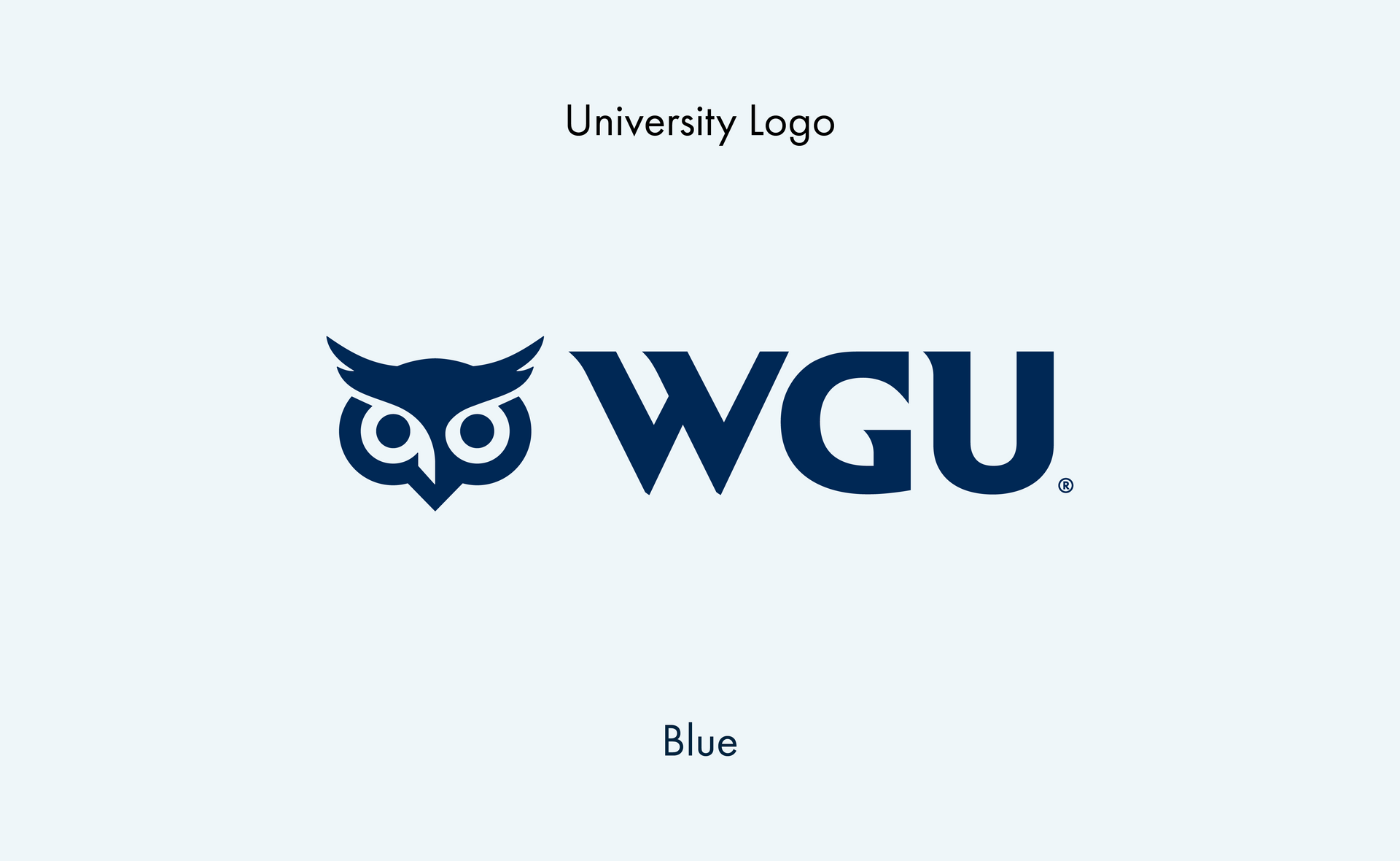
Slide title
Write your caption hereButton
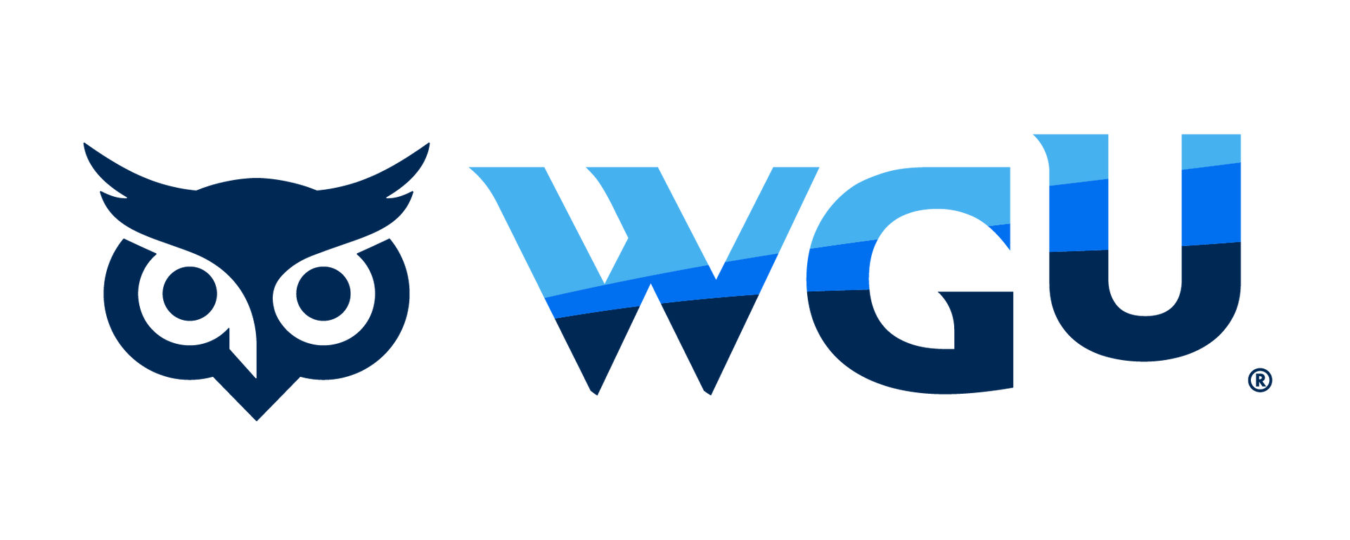
Corporate Logo
Our corporate logo captures a unique blend of identity and design. It features a letter character component that embodies our brand values, making it both memorable and representative of who we are.
Slide title
Write your caption hereButton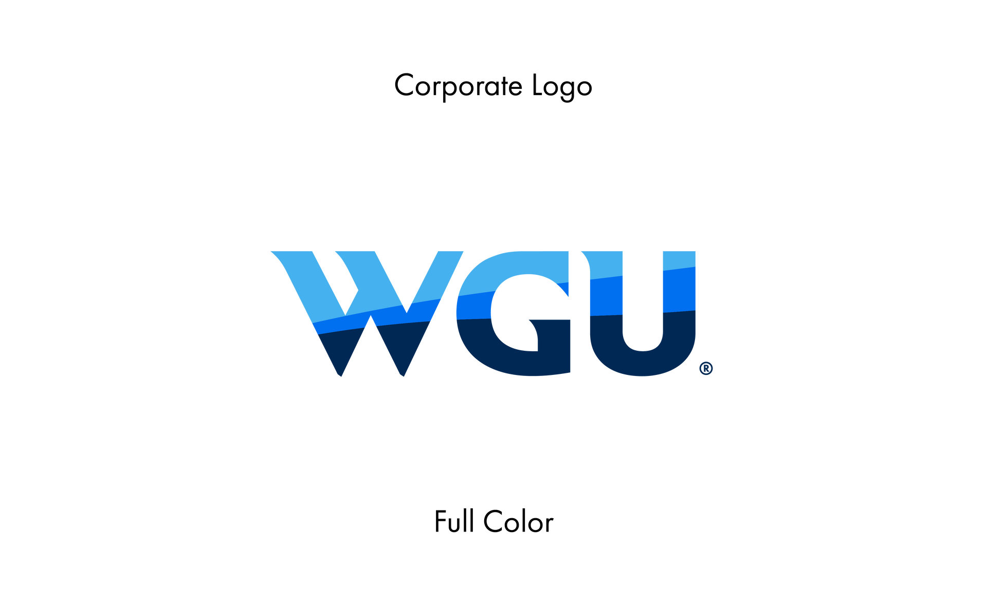
Slide title
Write your caption hereButton
Slide title
Write your caption hereButton
Slide title
Write your caption hereButton
Slide title
Write your caption hereButton
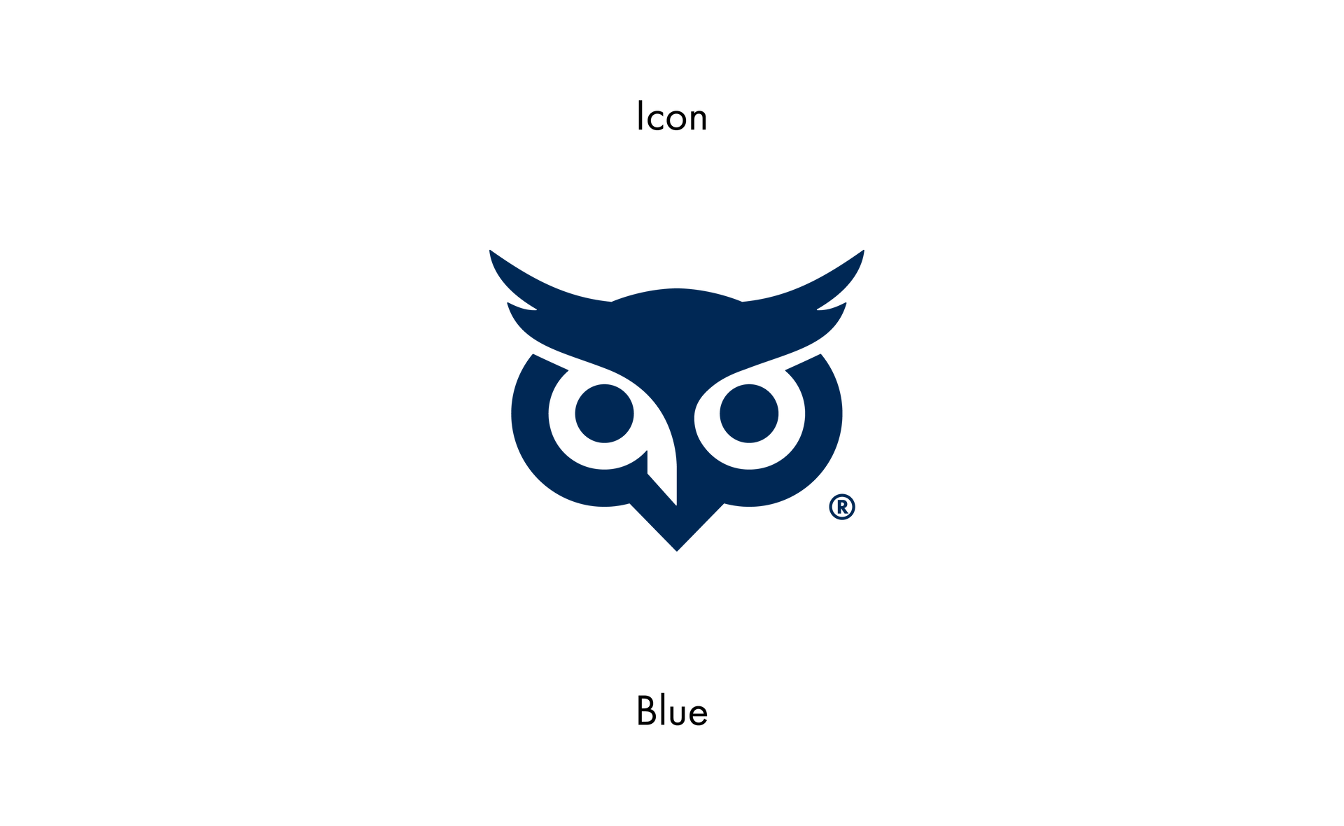
Icon
The owl head section is designated as the "icon." It represents a key element of our brand identity and symbolism.
Slide title
Write your caption hereButton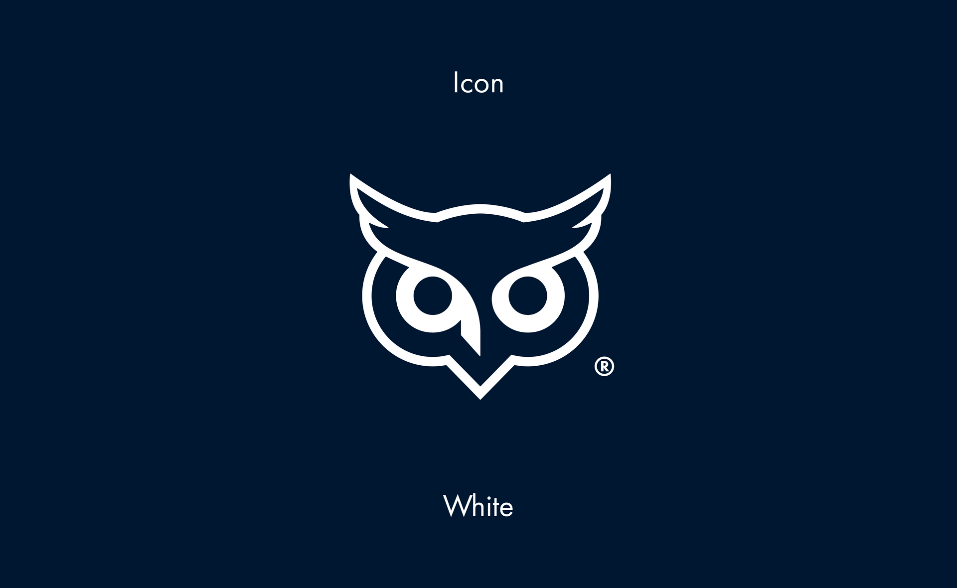
Slide title
Write your caption hereButton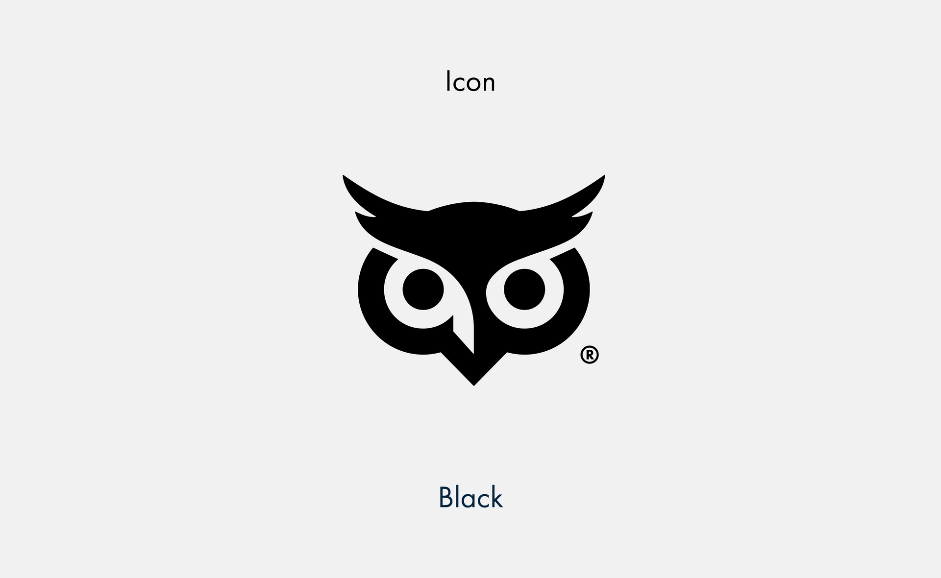
Slide title
Write your caption hereButton
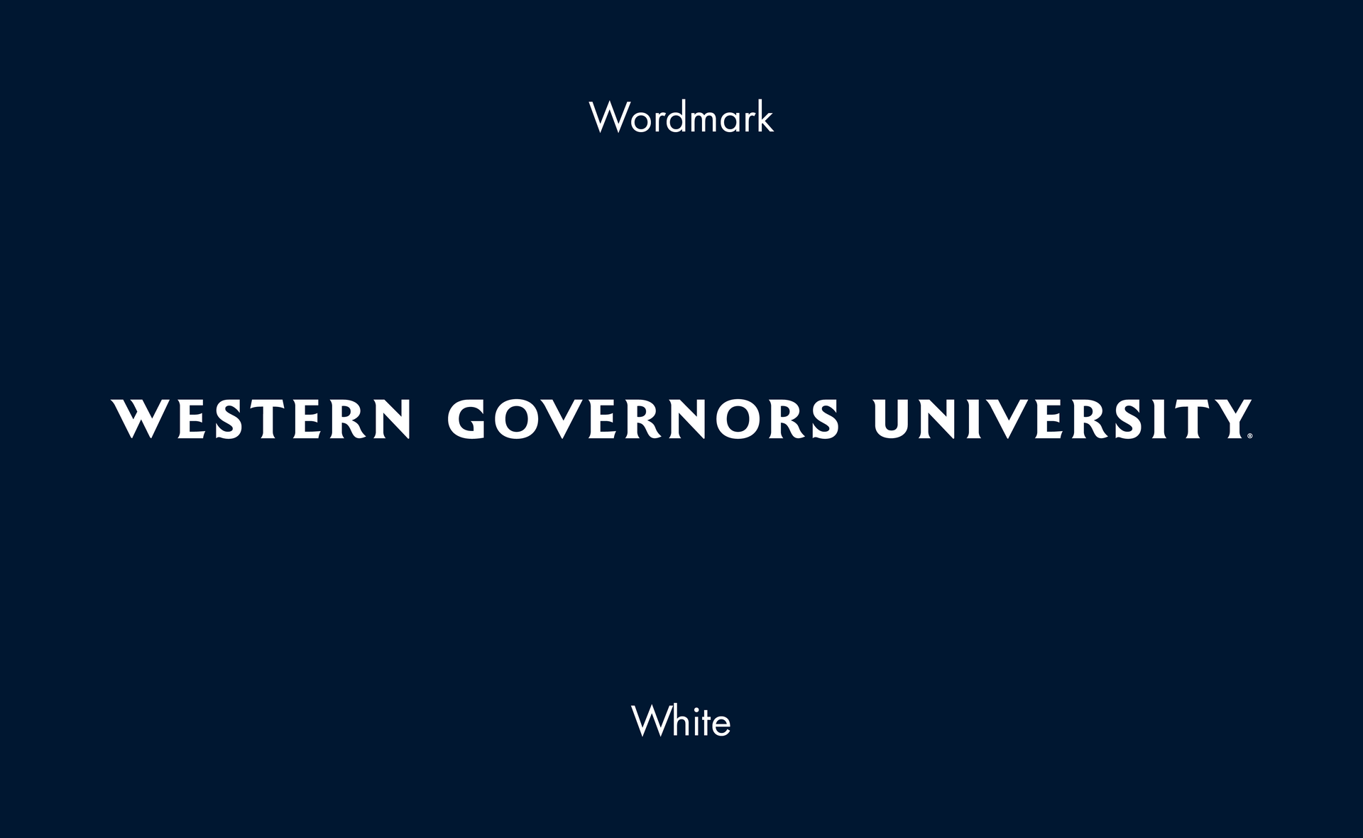
wordmark
The wordmark consists solely of our university name written in our specific and stylized font. It should always be used without the icon.
Slide title
Write your caption hereButton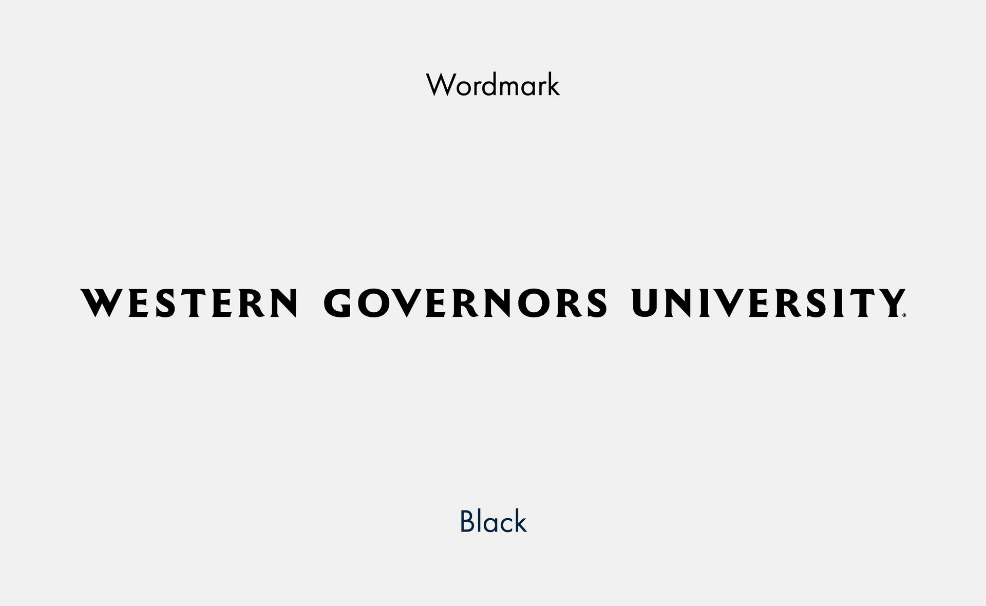
Slide title
Write your caption hereButton
Slide title
Write your caption hereButton
School lockups
A lockup is a combination of the university logo with an affiliated school name. School lockups are strictly reserved for official institutional use and must not be altered or customized beyond sizing. For visibility, lockup font size should never be smaller than 10 pt.

Slide title
Write your caption hereButton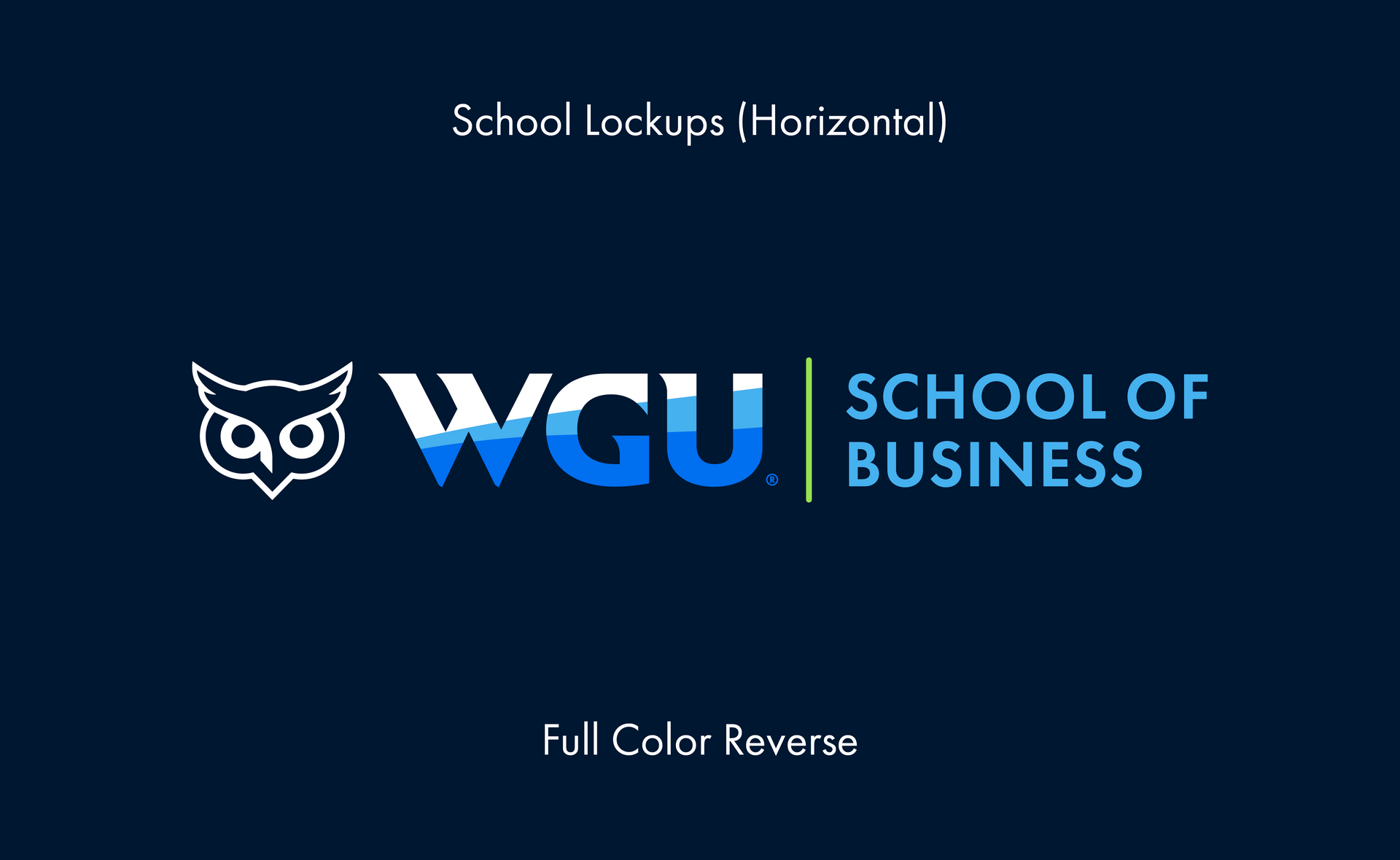
Slide title
Write your caption hereButton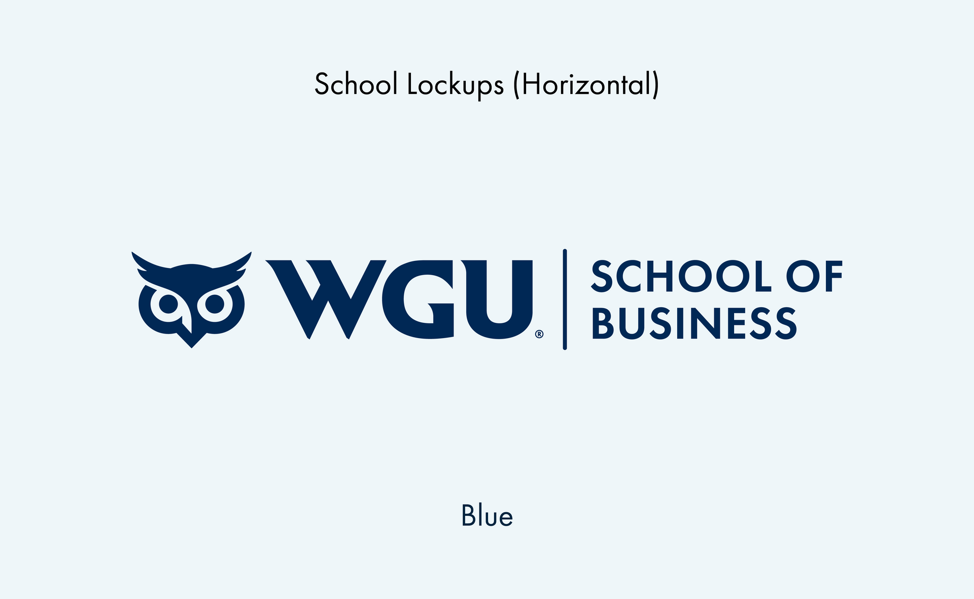
Slide title
Write your caption hereButton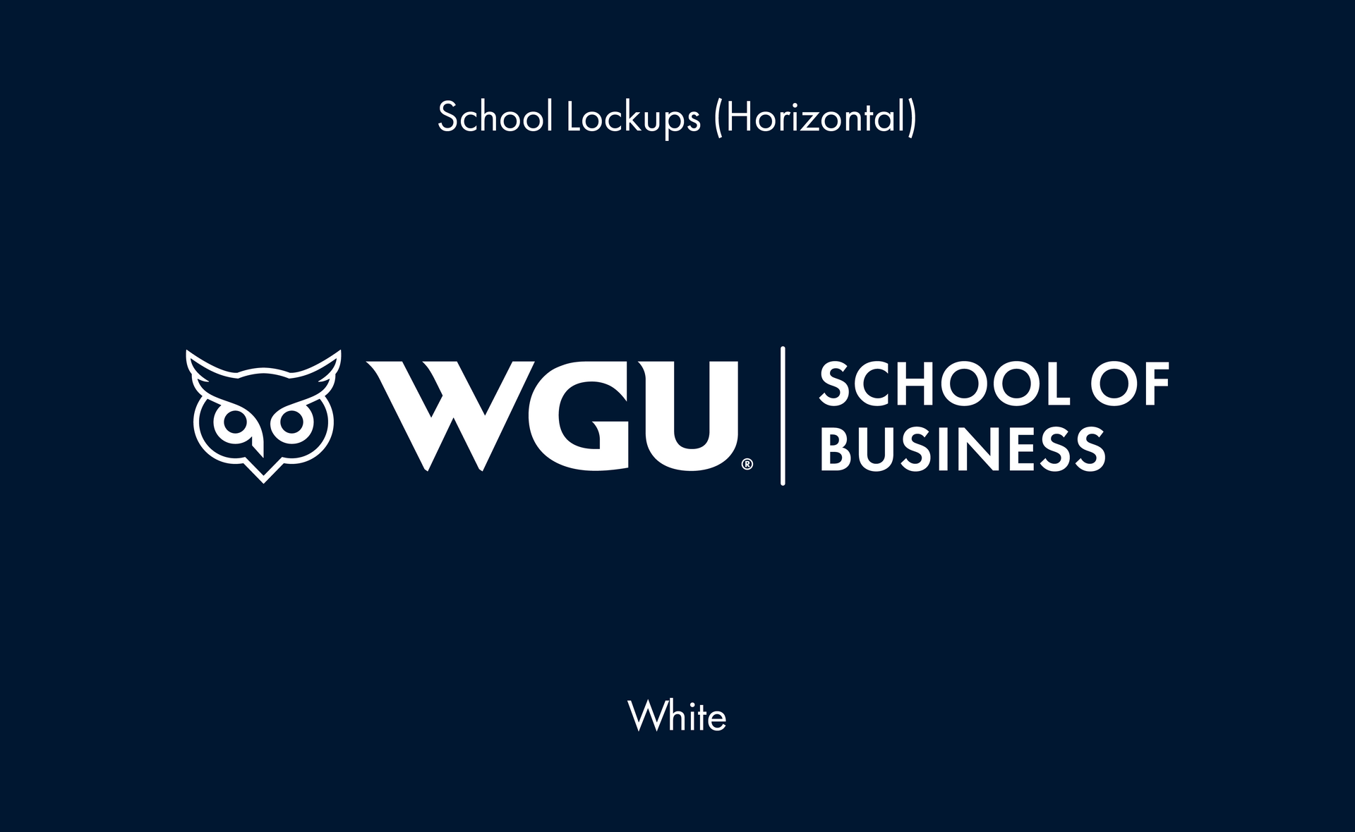
Slide title
Write your caption hereButton
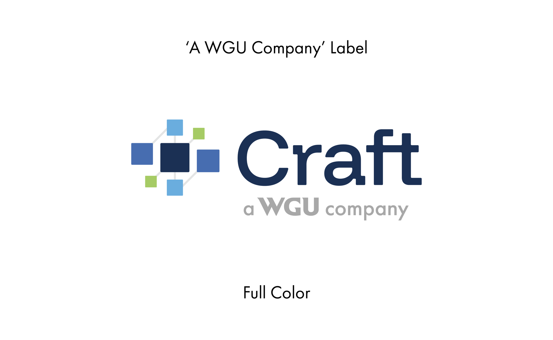
’A WGU COMPANY’ LABEL
A tagline that may be applied as a sub-head to WGU Corporation entities that do not carry the WGU name (e.g., Craft, Juvo) in order to show connection to WGU family of brands. For visibility, lockup font size should never be smaller than 10 pt.
Slide title
Write your caption hereButton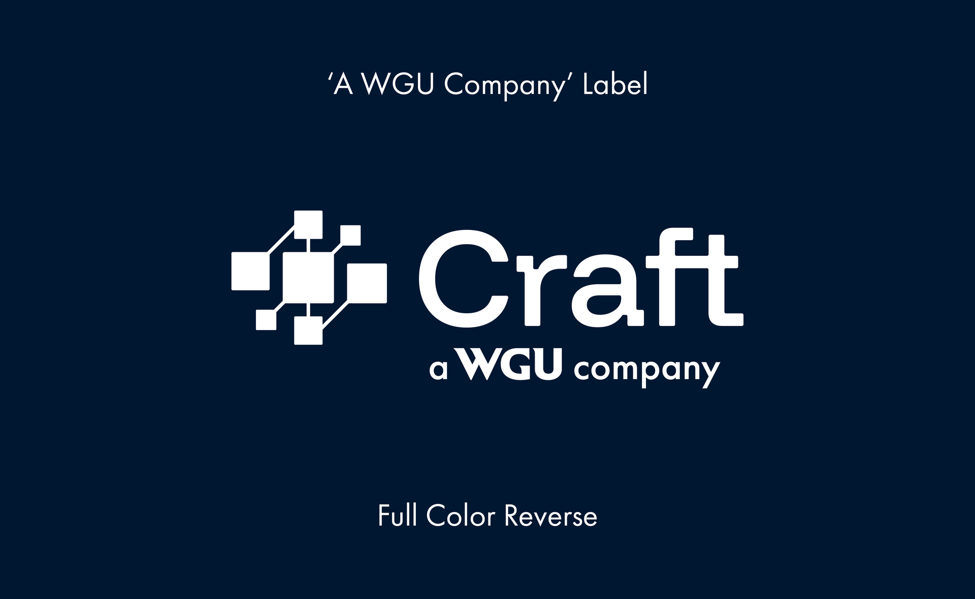
Slide title
Write your caption hereButton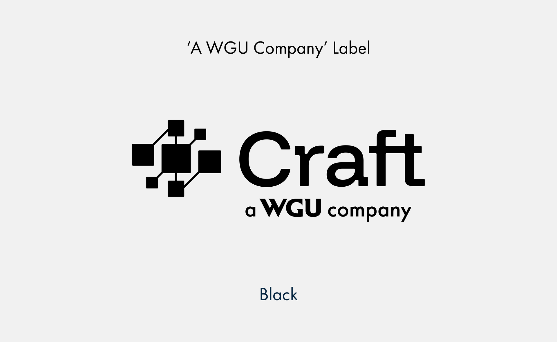
Slide title
Write your caption hereButton
To protect the integrity and readability of our logo, you must leave the required minimum (or greater) clear space around the logo or lockup on all four sides. That minimum clear space is defined as half the X-height of the WGU master brand mark. The only exception is the clear space around the icon, which is determined to be one-third the height of the icon. There are no other exceptions.
To ensure legibility and recognition on printed or web materials, the university logo, with or without the tagline, may not appear smaller than 0.725 inches wide in print, or 52 pixels wide in web use.
Note: There are times when making the logo as large as possible within the visual space it occupies can also mean making the logo visually unwieldy. When placing the logo, leave space around it. It should not feel visually crowded.
CLEAR SPACE and MINIMUM SIZE
Description Title
All logos should be used as supplied from Marketing and not altered in any way. Our brand aims to preserve its logo integrity across all channels. Do not modify proportions, spacing, and size relationships established for organization-wide consistency. Additionally, do not alter, modify, or recreate logos. If you use or see a logo excluded from this guideline, it is likely outdated, unauthorized, or removed from our brand. If you are unsure of logo usage, reach out to the Brand Governance Team for assistance.